Clarity is most important when it comes to PowerPoint presentations. Personally I have a little OCD when it comes to font, colors and design. The aesthetics of a page are vital to me and also vital to the clarity of the page and the effectiveness in trasmitting the message. The following are a few pointers from the reading summary presentation we did last week:
1. Use fonts that suit the intended message.
People tend to get carried away by the choice of fancy fonts provided by Microsoft and consequently kill the message being sent. Marquez Z.L (2010) states that a good presentation should be easy to read and recommends standard letters, like Arial or Times New Roman. Fancy fonts distracts the audience, diverting their attention to the font design rather than the key messages intended in the presentation.
2. Paraphase your points. Even better? Summarize them in point form. Text in powerpoint presentations are not meant to be read verbatim but to be use as triggers of ideas and guide to the presenter. Text can be used to emphasize important data e.g. during a presentation on sales of a company, the sales figures projected on the screen while the presenter rattles out the numbers is effective in driving home key data.
3. Use images to back up your points.
Multimodality is key. According to Schriver (1997) pictures and text can be utilized to enhance the message and make communication easier. Wendy Russel (n.d) says to avoid having text only slides- a combination of photos, charts and graphs and even embedding digitized videos with text, will add variety and keep your audience interested in the presentation.
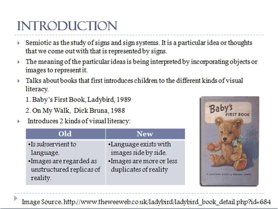 A screenshot from our group presentation last week
 Note: The clear fonts, information summarized in point form rather than full sentences, the usage of charts and also the inclusion of images for effectiveness and attractiveness.
4. Take note of slide layout and composition.
Kress G and Van Leeuwen (2006) introduces to us three principles of composition: Information value, salience and framing. Wendy Russel (n.d) further elaborates by stating that by putting your title at the top of the slide and also ensuring that your phrases read left to right and top to bottom will make understanding your slides easier.
Kress G & Van Leeuwen, T. 2006, Reading Images: Chapter 6 The meaning of Composition
Marquez, ZL 2010, 'How to make a good powerpoint presentation?', Ezine Articles.com, accessed 31st August 2010, http://ezinearticles.com/?How-to-Make-a-Good-PowerPoint-Presentation&id=4313178
Schriver, KA 1997, ‘The interplay of words and pictures’, Dynamics in document design: creating texts for readers, Wiley Computer Pub, New York, pp. 361-441.
Russel, W n.d, '10 tips for creating sucessful buisness presentations', About.com guide, accessed 31st August 2010, http://presentationsoft.about.com/od/powerpointinbusiness/tp/bus_pres_tips.htm